Videocall App

A bit of Context...
Due to the lockdowns imposed by the pandemic, video conferencing software demand increased. Berst, a desktop and web app application, was popular among users because it made it easy to create and manage workshops with multiple breakout rooms, resulting in increased engagement and similar interactions as in a physical setting.
However, born in the stay-at-home era, Berst was not optimized for mobile devices. With four weeks to redesign the entire application, our goal was to make Berst mobile-friendly and provide users with an excellent experience on-the-go backed by UX research.

North star statements throughout the project
Problem
Our comprehensive UX audit revealed that Berst's mobile experience was lacking. In addition to having difficulty navigating the app on mobile devices, users had to download the native app, interaction was inconsistent with the desktop app, and there were no accessibility features. Additionally, Berst's development costs increased due to the maintenance of its native applications.
Way of working
Three main aspects were involved in how we sorted this activity according to “Everest Engineering’s way”:
- Collaborative EnvironmentThe entire UX Research and design conception was intended to be collaborative from start to finish, involving the development, business, and design streams from kickoff. The decision-making process considered all three streams. In order to make sure the product was the best it could be, each member provided feedback and advice from the respective field.
- Clear goalAt kickoff, we defined the problem we wanted to solve and decided on a common mission. There was no doubt Berst could be improved, but the question was, what should be improved and how? Together with the hypothesis on how to solve this problem, we reviewed it before every workshop in order to ensure decisions were aligned with it.
- Pragmatic planOur project had a deadline of four weeks, so we planned accordingly. We mapped out the tasks that needed to be completed. We also established decision points and conducted regular check-ins to ensure everyone was on task.

Initial workshop plan
Process
At the kickoff, we outlined a plan so that it was expected that every week must show some progress toward the finished result, which included two things:
- Main UX research activities of each week
- The weekly ceremonies include daily sync between Design and Development, midweek sync between Business and Development, and Friday workshops to summarize the week’s insights, make decisions, and plan the week’s activities.
This ended up becoming the 4-week plan:
Week 1: Kickoff, UX interviews & survey
As part of the kickoff briefing, the designer discussed the product vision, outlined user problems, and ping-ponged ideas about research objectives with Berst CEO and development peers. Due to the short timeframe of the initiative, we started by conducting three research activities based on what was known from the briefing. These activities included:
- Survey: A survey of Berst users. 76 people responded.
- Market Research: Analyzing other videoconference platforms’ designs and interactions
- User Interviews: Recruited 6 users from different departments to understand their usage of Berst and mobile requirements.
The first week ended with a workshop, in which the mission was defined, user interviews and surveys were presented, and a voting exercise was conducted to prioritize mobile features. Card sorting was used to group features. The plans for next week were outlined.
Week 2: First mockups
For the second week’s activities, designers worked together with developers to discuss the best approaches and technical feasibility of UI design mockups based on the research done in the first week and the decisions made in the Friday workshop. To mix it up, along with design reviews, the designer encouraged the developer to illustrate how they thought the designs would work best in combination with the current technical framework and use out-of-the-box functionality.
During the second week’s workshop, the three streams reviewed designs and determined which ideas should become experiments and turned them into prototypes. Business-wise, designs had to align with the product vision, technical-wise they had to work with the existing code and design-wise they had to follow UX design guidelines.
Week 3: Prototyping & user-testing
In accordance with the decisions made in the workshop the previous week, prototypes were built. We recruited users to do user-testing of the different concepts and provide feedback on the ideas that were being contested at the workshop. Mid-week the was a vital sync with the client to show mid-way results and align on the direction prototypes should go.
The third-week workshop has been rescheduled for Monday due to the length of the process of creating prototypes and doing user testing.
Week 4: Design definition & direction
The final week started with a review of the insights from the user testing. These were discussed in the group and decisions were made for the next iteration of the design. The remainder of the week was about finetuning the designs so that they could follow the insights from the user interviews and survey of the first week plus the newfound insights from the user testing of prototypes.
During the final workshop, it was important to showcase the design, document the decisions that were made and specify the finer details of the UI such as spacing, colors, typography, and layout. This was done in order to ensure that the design was successfully implemented and all stakeholders were in agreement.

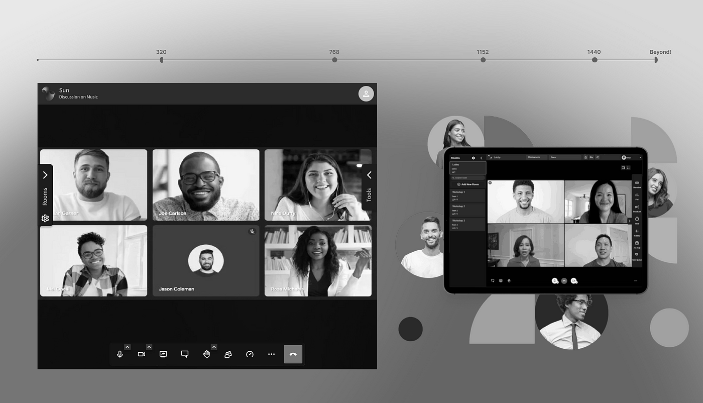
Responsive web app final product.
Solution
We conducted a comprehensive UX audit of the Berst web app and analyzed our user research to identify the key areas of improvement. Based on our findings, we decided to focus on the following areas to make Berst mobile-friendly:
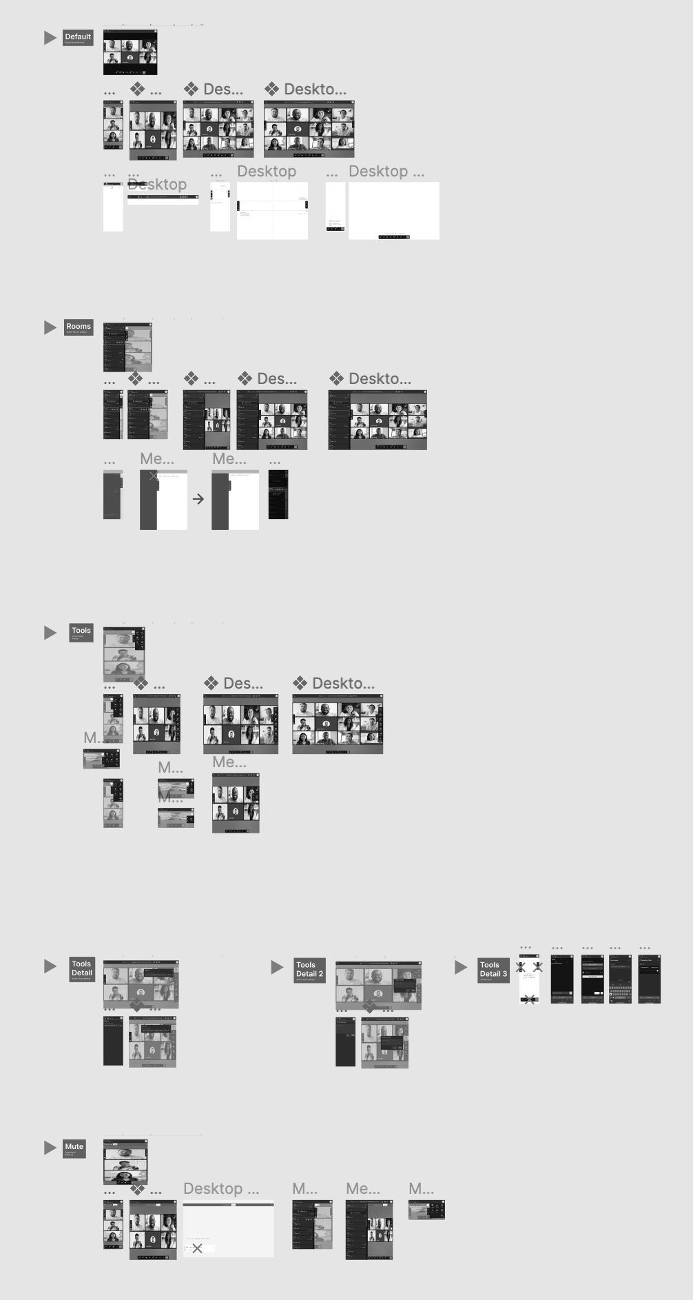
- Responsive Design: The desktop version of Berst was designed to fit a large screen, which made it difficult to navigate on mobile devices. We ensured that Berst's design was responsive and could adapt to different screen sizes.
- Simplified Navigation: We simplified Berst navigation by grouping features into logical sections. This helped users quickly find the features they needed without having to navigate through multiple menus.
- Mobile-first Features: We added mobile-first features such as swipe gestures for navigating between screens and using the camera and microphone in landscape mode.

Responsive designs using Figma breakpoints
Outcome
Our efforts resulted in a mobile-friendly version of Berst that provided users with a seamless video conferencing experience on-the-go. The responsive design and simplified navigation led to an increase in user engagement. The costs saved on maintaining the native application were used into improving the functionality of the web application.
Conclusion
Despite a short timeframe, we were able to conduct lean UX research and improved Berst significantly. With a clear goal in mind and keeping the business, tech, and design streams in sync, we were able to conduct a variety of user interviews, a survey, and prototype testing to get feedback from our target audience, which helped us identify areas for improvement and come up with a design that would benefit them.
As a result, Berst’s mobile-friendly version displayed an excellent video conferencing experience on mobile devices. UX Research was low cost, and the design handover was seamless, resulting in low development cost.
Bonus
Due to how the collaborative nature of the entire research there were extra «delights» along the way:
- The business lead provided the original vision of the project and allowed us to re-evaluate features that were not «technically possible» a few years back
- Developers noted easy wins we could add using the current framework. Adding GIF reactions as part of messaging was one of them: people loved it instantly!
- The months when the designs were being developed ended up being easier due to the development team's involvement in the initial process