Design
System
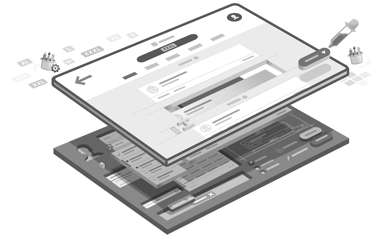
Main illustration of Appway's Design System
Problem
The user interface of new client projects were created from scratch or using another project as a starting point; even though the requirements would vary between them. Overall there was no unified approach into building projects and upgrades were resource intensive since every aspect was custom-made.

‘Let's focus on the integrating the backend first and we see what we do in the frontend afterwards... we could use an old project’
Application Developer
Needs to create the UI of projects from scratch or hack his way through existing projects

‘Every change/upgrade in the front-end of my solution very expensive’
Client Project Manager
Had a tailor made application made for her organization
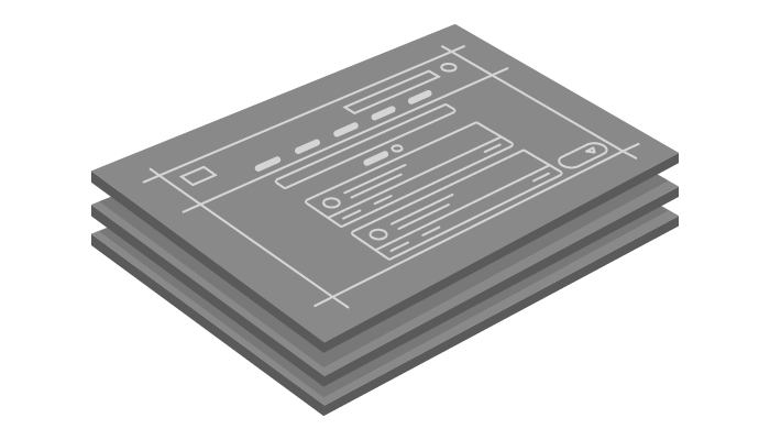
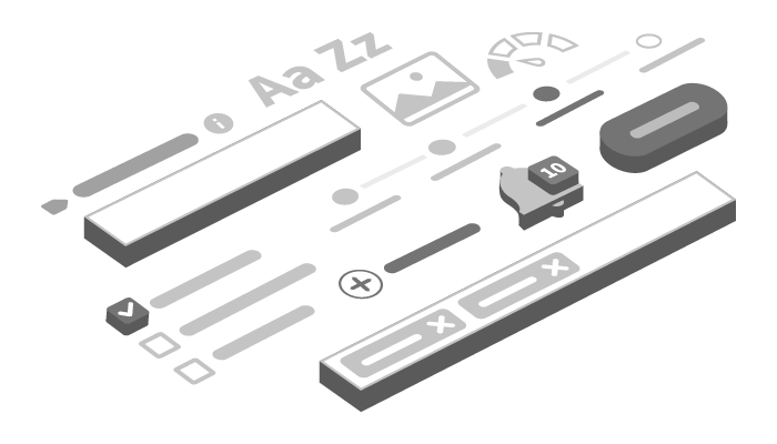
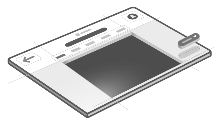
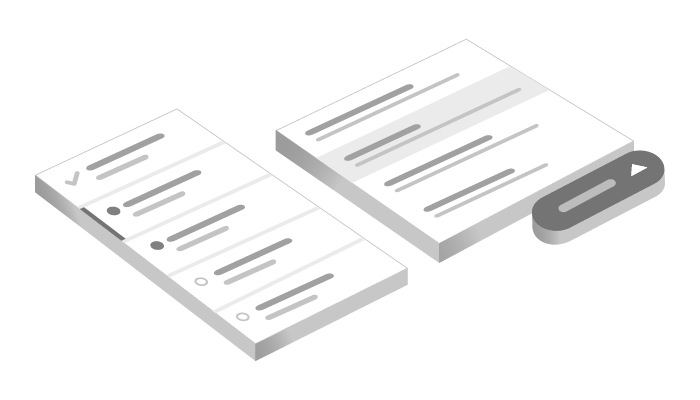
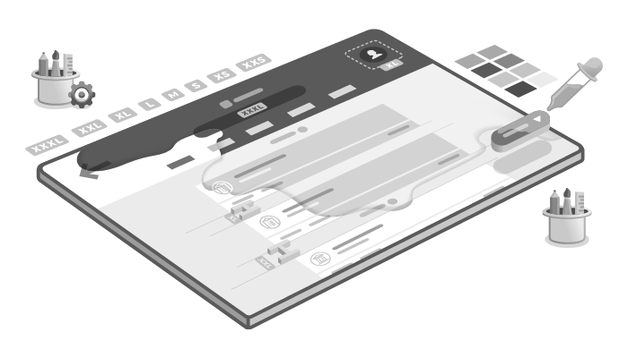
The 5 pieces of Appway's Design System: Patterns, Screen Templates, Solution Components, Screen Components and Theming
Proposal & Process
The proposal was to create a Design Systemthat allowed developers to replicate designs easily by using premade UI components & modules and following a set of patterns:
During a period of 6+ months it was necessary to go through hundreds of activities, the key activities I was involved in:
- Identify patterns used in previous projects: identify tendencies and best practices together with developers
- Create high level customer journeys of existing applications: identify user activities
- Group existing patterns and match with user activities
- Define what is required of each area when creating applications
- Define initial stages/templates of applications
- Draft first designs based on template and component requirement
- Create innitial prototypes of templates and components
- Define configurations and document
- Create a development package based on components
- Evolve and fix bugs of the development package based on additional research regularly
- Maintain documentation, development packages and E-Learning up to date
All of the activities mentioned above were part of an iterative process, many were done multiple times through numerous Sprints.
Result
This project had 3 main deliverables: a development package that contained all of the UI code that made up frontend, a website where all of the principles, patterns and components were documented and an E-Learning course that explained in-detail how to use the design system.
These 3 deliverables allowed for the following results:
- Continuous improvement Clients can now benefit from updates in the UI of their projects with the click of a button since seamless roll out updates of the Design Systemare made possible by its self-contained architecture.
- Scalable design and development Developers are empowered by reusing prebuilt modules which accelerates development and guides them in creating an effective user experience.
- Efficient team collaboration A shared common language was created for expressing solution ideas, with the patterns and modules serving as vocabulary.
- Cohesive experience across applications A seamless customer experience was ensured due to visual consistency across modules and by applying the client's brand theme throughout their ecosystem of applications.
How to work with the Design System sales Demo.
Impact
The success of the Design Systemspear-headed a change in the company's way of working and business model.
Starting as a service company that supplied developers to work on top of a in-house made platform: to a product company that provided an array of ever-evolving functional applications packages that could be mixed & matched by the client in their ecosystem.
This meant for the company's business model that clients would no longer pay one time per project development & maintenance, but would now subscribe to the application packages they adquire. This subscription would include upcoming updates, documentation and E-learning.
This also paved the way to a business only logic approach: were applications can be configured by business stakeholders and the UI is automatically generated without additional coding required.
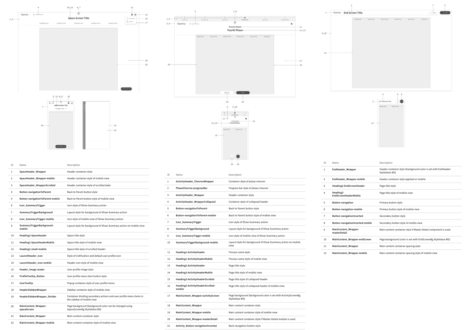
Documentation of 3 Screen Templates: Space, Activity and End Screens.
Challenges
This initiative faced many difficulties, among them:
- Fear of change by many colleagues in the Customer Success (CS) team meant that I needed to convince individuals to start adopting the design system. Multiple meetings, workshops, demos and hackathons helped us bring CS colleagues into the the journey.
- A lot of 'learning by doing': we started from scratch so everything we had in front was new for me and the team. This meant a lot of trial and error in the initial designs and code
- There were multiple layers of coordination across multidiciplinary teams: starting by the backend platform developers, moving to the frontend, design team, package development team, E-learning team, Customer Success team and finally sales.
- Documentation needed to be as clear as possible and up to date. Started with a PDF and evolved into a website with 100+ pages that was updated on a weekly basis.
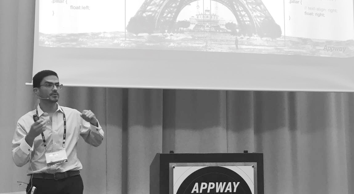
Ricardo Gerstl (with very short hair) presenting Appway's Design System in a conference
Role
This initiative required me to wear one big hat:
User Experience Engineer (Lead)
- Research: investigating users’ goals and problems we are trying to solve with the product
- Evolution: take responsibility of the transition from legacy elements into the new Design System
- Design: create solutions for these problems with thorough concept prototype and facilitate user testing
- Engineering: build the product’s UI keeping with technical feasibility, accessibility (a11y) and usability in mind
- Management: by leading a team providing new releases, bug-fixing, quality assurance, documentation and product evolution
- Communication: by developing & communicating the design principles across the stakeholders, colleagues and clients
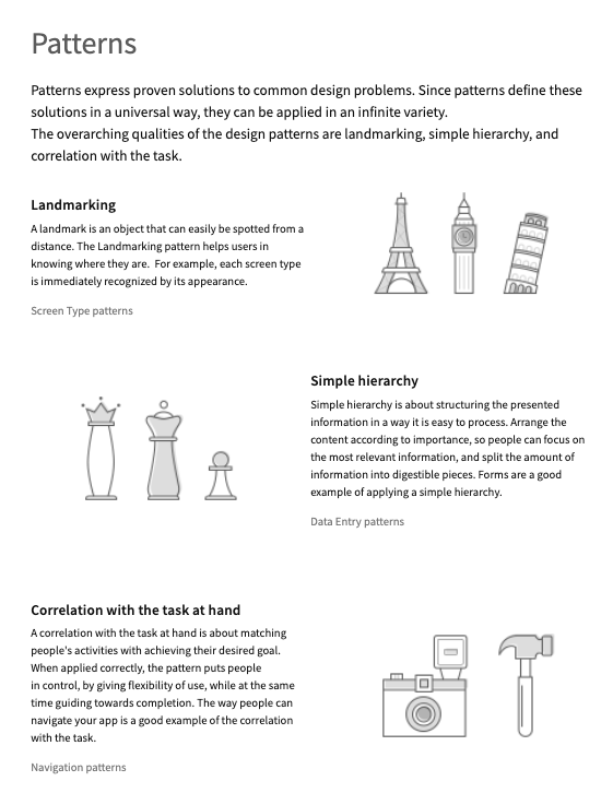
The 3 patterns work of the cornerstone of Appway's Design System.
Learnings
From this project I got four main takeaways:
- Bring people into the journey: this means a lot of talking. I prepared a generic slidedeck and demos I would present on a regular basis to stakeholders.
- Make allies across teams: I have one or two 'embassadors' across teams who provided regular feedback and supported the Design System adoption
- This project was aleays evolving, therefore it's success or failure couldn't be measured after an end date. That is why we needed to divide it into smaller projects to better understand progress.
- People don't read: documentation should have a visual material and an interactive part to support it. When possible, even create videos to send your message across.
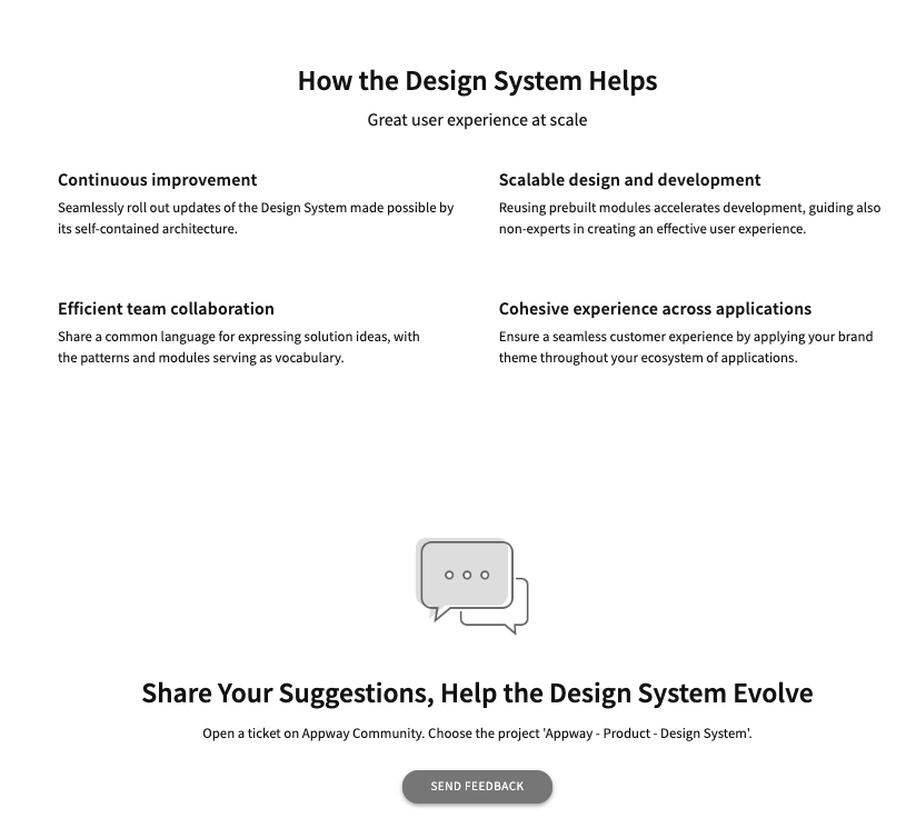
Appway's Design System mission and call for feedback.