
TL;DR
Fifteen ways to fake a link, and visitors left at level two.
Hitachi Energy · UX Researcher & Project Manager · 2020–2022 · Zurich, Switzerland
- The problem
- More than 15 elements could carry a link and many of them were decoration, so visitors could not tell what was clickable and bounced at the second level of navigation.
- What we did
- Audited 100+ pages component by component, then replaced fifteen link candidates with a documented link set: one job per type, every state visible before the click.
- +40%reached level 3+ (target >25%)
- 100+pages audited
- 15 → 4link types
- 1,600+pages under watch
A fuller prototype pass was planned and dropped for lack of time; usability testing stayed at the walkthrough level.
- Google Analytics
- Crazy Egg
- Figma
- Microsoft Outlook
- Microsoft Teams
 Ricardo GerstlUX researcher & project managerAudited 100+ pages, ran the analysis and defined the link set.
 Krista V.Digital communications specialistPulled the Google Analytics and Crazy Egg data behind the audit.
Analysis
 Florian S.Product designer, design teamTook the analysis into the new link designs.
 Julia Sophie G.Regional brand managerChecked the new link set against the brand.
 Princi J.Delivery module leadBuilt and QA’d the components for release.
 Pablo C.Global web & intranet managerPrioritised the rollout across 1,600+ pages.
 Alessandro D.Digital marketing leadTold editors which link type to use, and when.
Handover & release
Interactive
Elements
Quick click-through a couple of Hitachi Energy Pages
Problem
The goal was to help people go as deep as possible into the site. Both the website and the intranet relied heavily on quantitative tools. On the website, Google Analytics showed flow, how deep people went, and where they bounced. A major finding: on certain hops, depending on the business owner, bounce points were especially sharp. Crazy Egg heatmaps showed how far people scrolled on the main marketing site, which parts were used, and where clicks landed. Together, analytics and heatmaps showed a drastically high bounce rate on shallow pages near the top of the navigation hierarchy. Many users left before they reached deeper content. Pages that were two or more levels deep were hard to reach. People often found them only through search or links from outside the site.
‘Some of the objects in the page are clickable others are not yet they still look similar? ...also even if I manage to identify a link, I'm not sure where I'll be going next ’

Client
Needs to actively identify links to navigate through content
‘There are more than 15 elements I can use as links. Many times I don't link them anywhere... just use them to make the content "stand out"’

Web Editor
Decides on using linking elements randomly when creating pages
Proposal & Process
The proposal was to create one shared design for interactive elements, and to improve how existing components could be configured, so we could improve the user's foresight of the link created. In plain terms: help people see what they can click and where that click will take them.
Alongside the design work, research stayed practical and mostly internal:
- User interviews with colleagues on the intranet and website: how they looked for answers before opening an HR or IT ticket, what they searched for, and what they grepped for when something was missing.
- Surveys and questionnaires on the intranet and website. The most important ones lived on the intranet: was search useful, were people using it properly, and for specific document areas, did they find what they needed and what did they expect from each document.
- Usability testing for new features at a high level: showing designs and walking through the signs of the experience, not full lab protocols.
- A/B testing, including a notable cookie-banner study on the website: a full-page block, a top banner, a large banner with every option, and a banner that was easy to close without accepting. We tried them all and picked the design that let people accept cookies themselves.
- Google Analytics and Crazy Egg heatmaps to spot weak click targets, bounce points, and how far people actually read.
It was necessary to go through the following steps:
-
Listed all of the existing interactive components
-
Provided a visual guide of the configurations available per component
-
Visually displayed their states
Initial, hover, active...
-
Analyzed how the components were being used
For example, pointing to video, linking to internal pages, linking to documents, and so on
-
Created a new style for existing components
Started with a concept of the basic button and grew from there
-
Tested prototypes of new designs collaborated with branding on new designs
-
Mapped all existing configurations to the new designs
Established new configurations that could improve the user experience
The audit started as a wall of pages, grouped by the component that carried the link.
Then each component got one row: its states, and what it could point to.
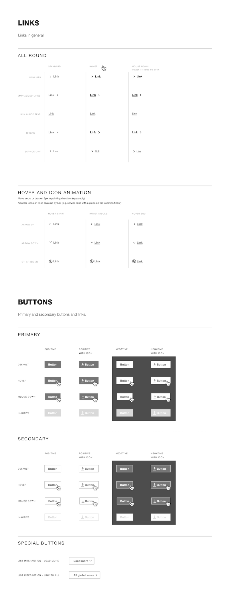
Design Specs for buttons and links
With the specs in place, every old way of making something look clickable was mapped to one of the new link types, or dropped.
Result
Clear affordance, information about each link's target, and a consistent design across interactive components made it easier for users to differentiate between a teaser component and an image, a link and highlighted text, a link to a video or a link to a document, and so on.
Several months after the redesign of the interactive components, we compared bounce rate on high-level pages through follow-up Google Analytics and heatmap checks. We saw a drop in the amount of users that left the website on that level.
There was a large increase in visits to pages on a third level or deeper (in many cases a 40+% increase).
Additionally, editors working on the website and colleagues across the company shared positive comments about how much easier it had become to navigate between pages.
Documentation of the Teaser component: content editors' favorite component for linking pages because of its visual appeal
Impact
- Before
- More than fifteen elements could carry a link, and many were used for emphasis rather than navigation. Visitors could not tell what was clickable.
- After
- One documented link set, one job per type, every state visible at rest. 40% more visitors reached pages three or more levels deep, against a target of 25%.
Ways an editor could make something look clickable, before and after the audit.
Better reach of low-level pages meant an increase in the number of viewers of these pages on the external website.
There was a decrease in the number of ticket requests to the IT and HR departments. Before the redesign, many tickets were about documents that were already publicly available on the intranet.

Design Specs for Anchor components: used for in-page navigation.
Challenges
This initiative faced many difficulties, among them:
- To keep a smooth transition without manual edits on almost every page of the website and intranet, the structure of existing components could not be broken. That meant we could mainly change appearance, or add configurations with a "smart default" tied to each component's existing settings.
- Deprecating an existing component needs long-term planning, editor training, and clear communication about the deprecation. Additionally, the replacement should work in the most automated way possible.
- Long story short: we had to deprecate a component and later re-enable it. ):
Role
This initiative required me to wear two hats:
User Experience Researcher
- Used Google Analytics and Crazy Egg heatmaps to find where people bounced, how deep they went, how far they read, and where clicks landed
- Created a list of all existing interactive components, with a visual guide of the configurations available for each one
- Went through 100+ main pages and analyzed how the components were being used
- Ran internal user interviews about pre-ticket search behaviour, plus intranet and website surveys and questionnaires on search usefulness and document-area findability
- Ran high-level usability testing by showing designs for new features (a fuller prototype pass was planned but not used due to lack of time)
- Reviewed accessibility of interactive states: visible focus, contrast on links and buttons, and clear names so assistive tech could tell a teaser, document link, and video link apart
- Ran A/B testing on the website cookie banner (full-page block, top bar, large options panel, easy-close without accept) and helped pick the version that let people accept cookies themselves
- Helped establish new configurations that could improve the user experience of the teaser component
Project Manager
- Coordinated the handover of analysis with the design team
- Supported critique of the first design iterations
- Coordinated collaboration between the branding team and the design team
- Handled QA, technical testing, and release documentation for the components
- Presented the new designs to the communications departments

Breadcrumbs became a standard in all templates for easier navigation.
Learnings
From this project I got three main takeaways:
- Visual changes can be a "hard sell" since the results take time to be considered quantifiable. If you are lucky, users will notice them as a good change and speak up about them.
- Put the cards on the table: make sure stakeholders understand the problems by showing the whole picture first, then focus on details when necessary.
- Component deprecation is a very delicate subject: timely communication and an alternate solution that works automatically are vital for a frictionless transition.