
TL;DR
Four weeks to mobile.
Berst · UX Researcher & Designer, Everest Engineering · 4-week engagement
- The problem
- Berst was built in the stay-at-home era for a large screen. On a phone people struggled to navigate, had to download a native app, and met interactions that did not match the desktop, while native maintenance kept driving up cost.
- What we did
- Redesigned the whole application responsively in four weeks, simplified the navigation, added mobile-first gestures and landscape camera support, and retired the native apps.
- 4 weeksresearch to delivery
- 76survey responses
- 6user interviews
- Native retiredapp store exit
- Figma
 Ricardo GerstlUX researcher & designerRan the survey and interviews, and redesigned the app for phones.
Design
 Peter L.Tech & agile consultantRan the delivery cadence and checked feasibility at every workshop.
- 2 developersBuilt the responsive redesign.
Development

Videocall App
The same markup at every width. It cycles on its own; take the handle to drive it yourself.
A bit of Context...
During the pandemic lockdowns, demand for video conferencing software went up. Berst is a desktop and web app that helps people create and manage workshops with multiple breakout rooms. Users liked it because it increased engagement and felt closer to the way people interact in a physical room.
Berst was built in the stay-at-home era, so it was not ready for mobile devices. We had four weeks to redesign the entire application. Our goal was to make Berst mobile-friendly and give users a strong experience on the go, backed by UX research.

North star statements throughout the project
Problem
A full UX audit showed that Berst’s mobile experience was weak. Users struggled to navigate on phones. They also had to download the native app. Interactions did not match the desktop app, and accessibility features were missing. Maintaining the native apps was also driving up Berst’s development costs. The team stopped investing in native right away, cut that maintenance work, removed the app from the app store, and asked people to use Berst from the website instead.
Way of working
We ran this work in “Everest Engineering’s way,” with three main parts:
Collaborative Environment
UX Research and design were collaborative from start to finish. Development, business, and design joined from kickoff. Decision-making included all three streams. Each person shared feedback from their field so the product could be as strong as possible.Clear goal
At kickoff, we defined the problem and agreed on a shared mission. Everyone knew Berst could get better. The real question was what should be improved and how. We also wrote a hypothesis for how to solve the problem. We reviewed that hypothesis before every workshop so decisions stayed aligned.Pragmatic plan
We had a four-week deadline, so we planned with that limit in mind. We mapped the tasks we needed to finish. We also set decision points and ran regular check-ins so everyone stayed on track.
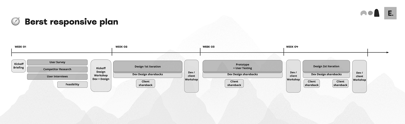
Initial workshop plan
Process
At kickoff, we set a plan so every week would show clear progress toward the finished result. That plan had two parts:
- The main UX research activities for each week
- Weekly ceremonies: a daily sync between Design and Development, a midweek sync between Business and Development, and Friday workshops to sum up the week’s insights, make decisions, and plan the next week’s work
That became our 4-week plan:
Week 1: Kickoff, UX interviews & survey
In the kickoff briefing, the designer talked through the product vision, listed user problems, and bounced research goals with Berst’s CEO and development peers. The timeline was short, so we started three research activities based on what we already knew from the briefing:
- Survey: A survey of Berst users. 76 people responded.
- Market Research: A review of other videoconference platforms’ designs and interactions
- User Interviews: We recruited 6 users from different departments to learn how they used Berst and what they needed on mobile.
Week 1 ended with a workshop. We defined the mission, shared findings from the user interviews and survey, and ran a voting exercise to prioritize mobile features. We used card sorting to group features, then outlined the plan for the next week.
Week 2: First mockups
In week 2, designers worked with developers on UI design mockups. We used the week 1 research and the Friday workshop decisions. Together we talked through approaches and technical feasibility. In design reviews, the designer also asked developers to show how the designs could work best with the current technical framework and with out-of-the-box functionality.
In the week 2 workshop, all three streams reviewed the designs. We decided which ideas should become experiments, then turned those into prototypes. For business, designs had to match the product vision. For tech, they had to work with the existing code. For design, they had to follow UX design guidelines.
Week 3: Prototyping & user-testing
Based on the previous workshop decisions, we built prototypes. We recruited users for user-testing of the different concepts, so they could give feedback on the ideas still being debated. Mid-week there was a vital sync with the client to show mid-way results and align on the direction the prototypes should take.
We moved the third-week workshop to Monday because building prototypes and running user testing took longer than planned.
Week 4: Design definition & direction
The final week started with a review of insights from user testing. The group discussed those findings and decided what to change in the next design iteration. The rest of the week was about fine-tuning the designs so they reflected the week 1 interview and survey insights, plus the new insights from prototype testing.
In the final workshop, we showcased the design, documented the decisions, and specified UI details such as spacing, colors, typography, and layout. That helped make sure implementation would go smoothly and that all stakeholders agreed.
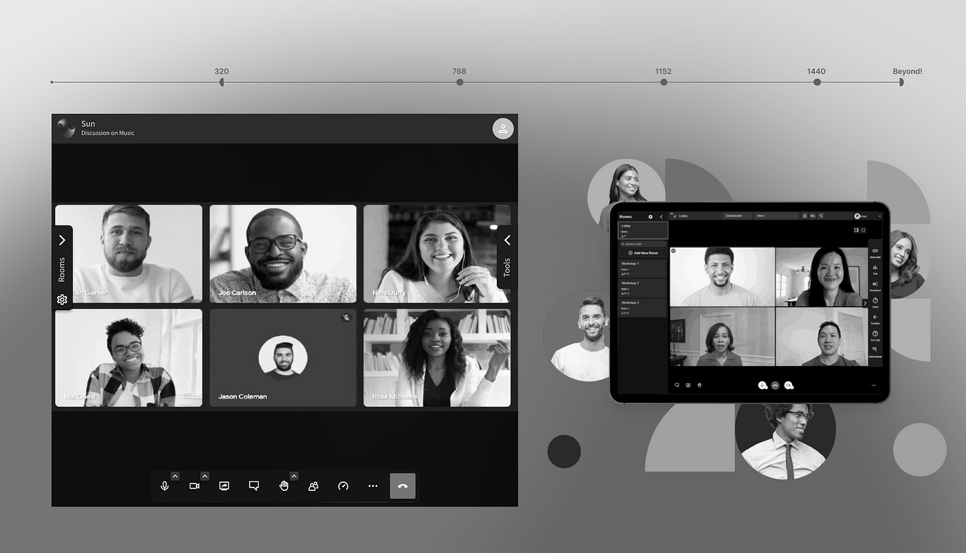
Responsive web app final product.
Solution
We ran a full UX audit of the Berst web app and reviewed our user research to find the main areas to improve. Based on those findings, we focused on these areas to make Berst mobile-friendly:
- Responsive Design: The desktop version of Berst was built for a large screen, so it was hard to use on phones. We made the design responsive so it could adapt to different screen sizes.
- Simplified Navigation: We simplified Berst navigation by grouping features into clear sections. That helped users find what they needed without moving through many menus.
- Mobile-first Features: We added mobile-first features such as swipe gestures to move between screens, and support for using the camera and microphone in landscape mode.
- Accessibility: We checked touch target size, focus order, contrast, and keyboard reach on the main workshop flows so the responsive web app stayed usable beyond mouse-only desktop use.
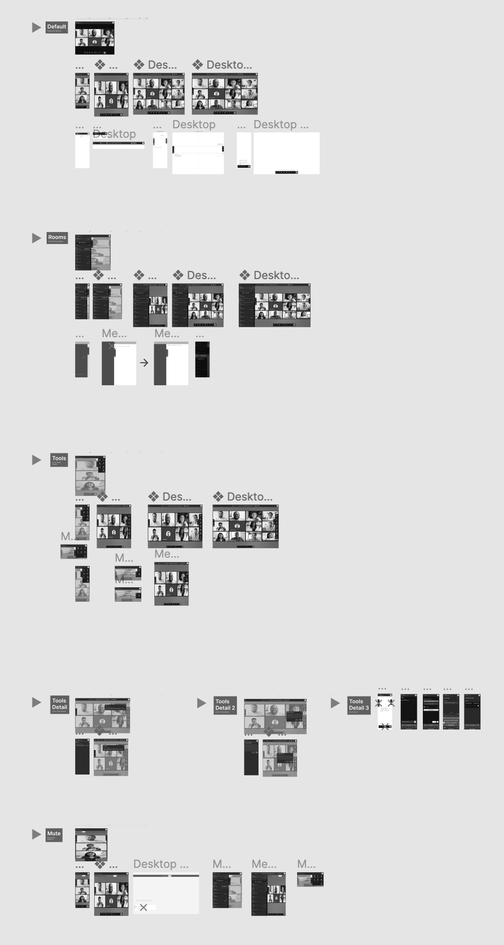
Responsive designs using Figma breakpoints
Outcome
We shipped a mobile-friendly version of Berst that gave users a smooth video conferencing experience on the go. The responsive design and simplified navigation led to an increase in user engagement. The team stopped investing in native, cut native maintenance, removed the app from the app store, and asked people to use Berst from the website. The money saved on native maintenance went into improving the web application’s functionality.
Conclusion
Despite a short timeframe, we ran lean UX research and improved Berst in a meaningful way. With a clear goal, and with business, tech, and design staying in sync, we ran user interviews, a survey, and prototype testing with our target audience. That feedback helped us find what to improve and shape a design that would help them.
As a result, Berst’s mobile-friendly version offered a strong video conferencing experience on phones. UX Research stayed low cost, and the design handover was seamless, which kept development cost low.
Bonus
Because the research was so collaborative, we also got a few extra «delights» along the way:
- The business lead shared the original project vision and let us reopen features that were not «technically possible» a few years earlier
- Developers spotted easy wins we could add with the current framework. One of them was GIF reactions in messaging: people loved it instantly!
- The months of building the designs went more smoothly because the development team had been involved from the start