
TL;DR
Editors stopped reinventing the page.
Hitachi Energy · UX Researcher & Project Manager · 2020–2022 · Zurich, Switzerland
- The problem
- Every page started from a white canvas, so each editor invented their own layout, and with it hidden content in tabs, misused tables and missing headings.
- What we did
- Replaced the blank canvas with topic templates built from mandatory and optional zones, then ran the training and release communications that kept 220+ editors on one model through two rebrands.
- 90 → 50 minto build a page
- 24+page templates
- 220+editors aligned
- 2rebrands survived
The editor saving is measured; the reader benefit is not. We had no analytics to show consistent pages were easier to browse. The estimate was ten templates. It ended at 24+.
Page Templates
Quick scroll through a couple of Hitachi Energy Pages
Problem
Pages did not follow a shared structure. That hurt both the user experience and the editor experience, because of higher cognitive load on users and higher effort necessary to create pages.

‘It is cumbersome to browse through pages, since each one is structured totally different; even though they inform about the similar products’
Client
Needs to actively understand the page before browsing through content

‘Since I have to come up with new layouts, every new page I create takes me more time to assemble than to come up with the content’
Web Editor
Starts with a white canvas when she is creating a new page
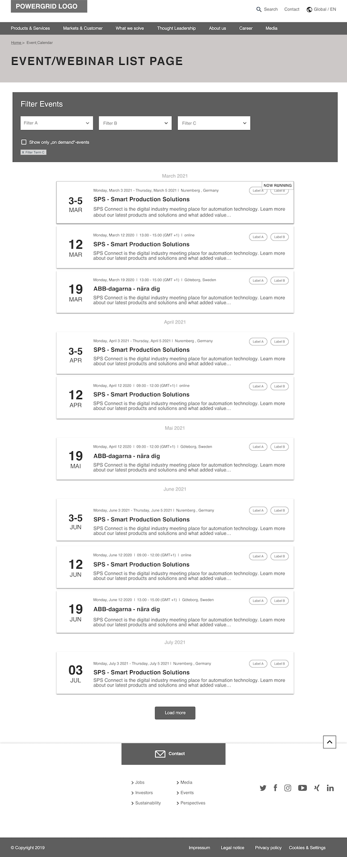
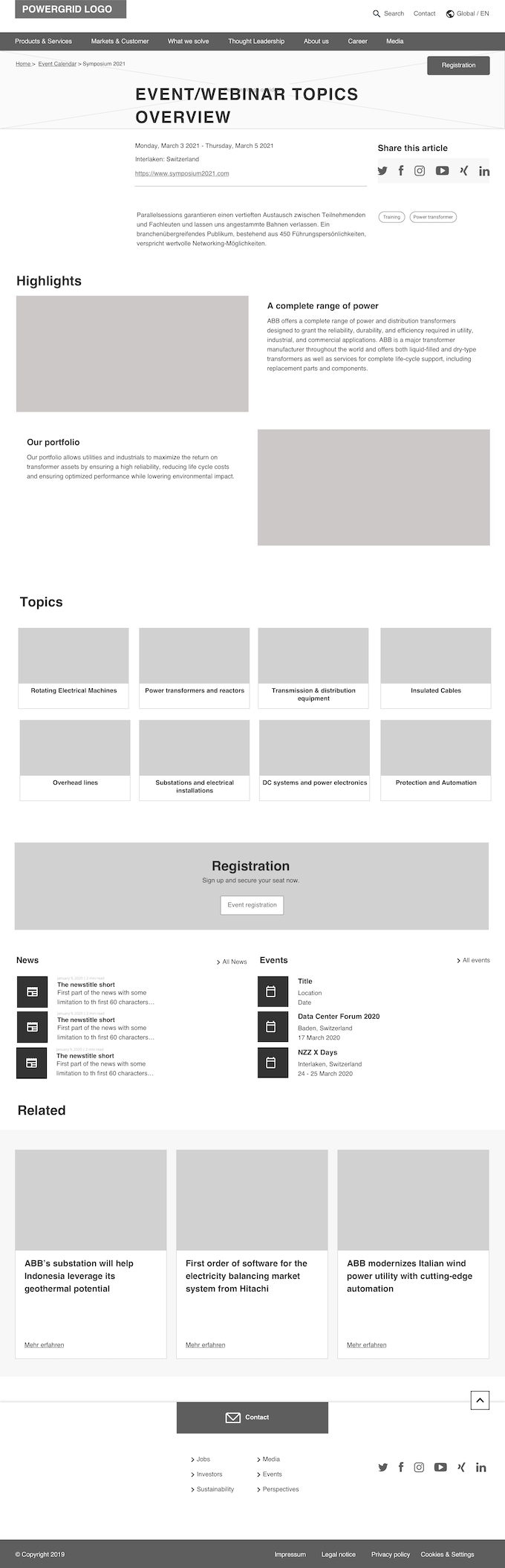
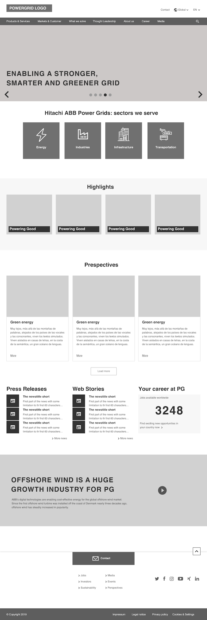
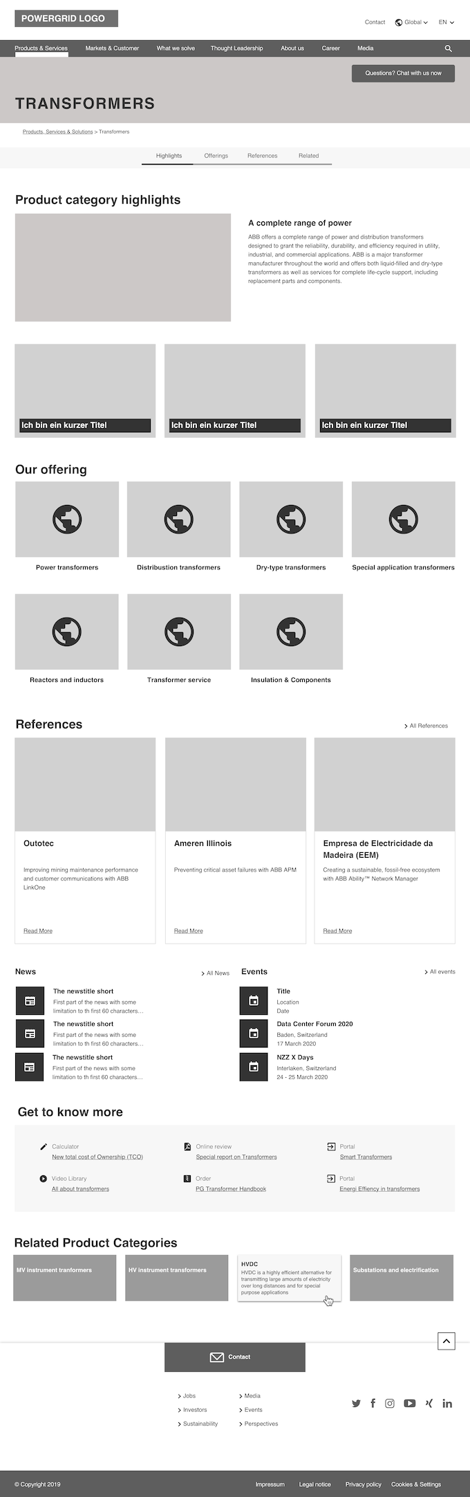
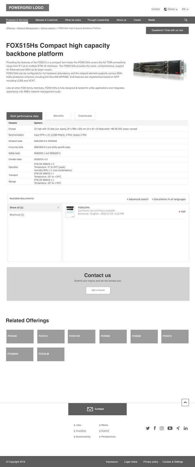
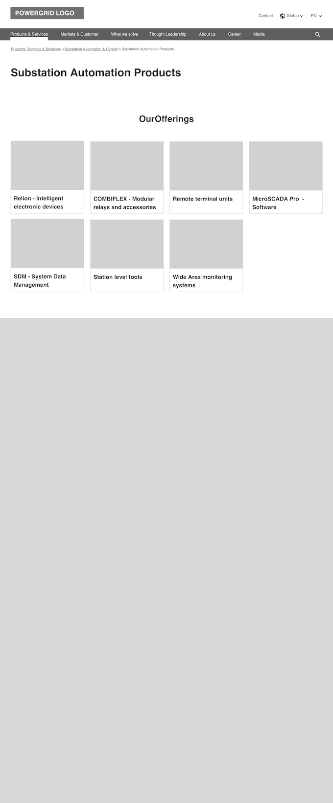
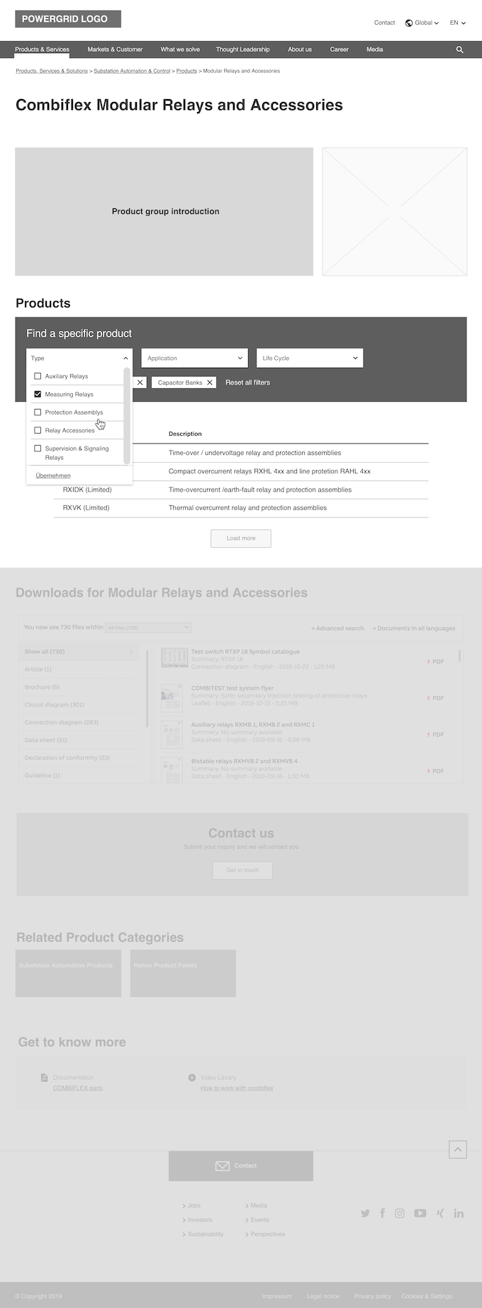
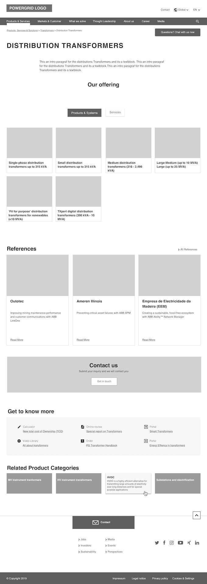
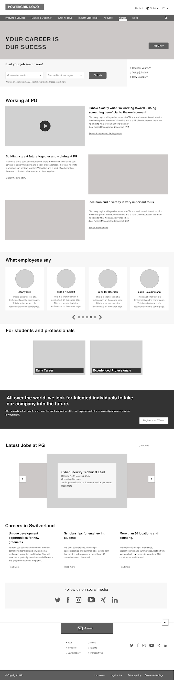
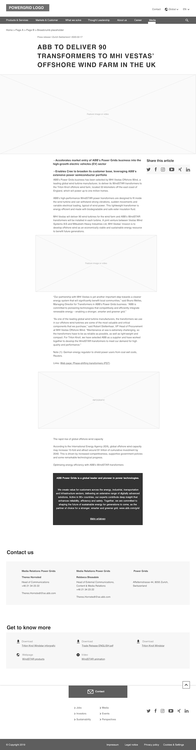
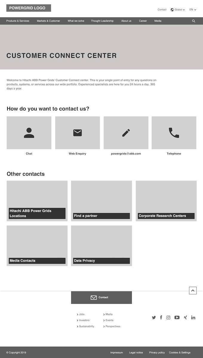

Wireframes of multiple page templates
Proposal & Process
The proposal was to create topic-specific templates that editors could use as a starting point.
Research sat inside the delivery loop. User interviews were internal only: editors, content owners, and colleagues who used the intranet and website day to day. We asked how they looked for answers before opening an HR or IT ticket, what they searched for, and what they grepped for when something was missing. Surveys and questionnaires on the intranet (and on the website) helped check whether search was useful and whether people found what they needed in specific document areas. Usability testing for new features stayed high-level: we mainly showed designs and walked through the signs of the experience before build.
It was necessary to go through the following steps:
- Divide pages into topic types
- Analyze existing pages: identify patterns and best practices together with content owners
- Create wireframes based on that analysis
- Prioritize page areas and decide with content owners which should be mandatory or optional
- Translate wireframes into available frontend components
- Create visual mockups
- Get sign-off from content owners
Result
Editors gained a starting point that lowered initial effort and even shaped how they structured content on a page. Three months after the release, we held Q&As where editor feedback was excellent. They pointed out a big improvement on their workflow thanks to templates.
More consistent pages also helped people who were browsing content, because pages became more predictable regarding how content was arranged on each page. We did not have analytics data that could support this browsing benefit. What we could show clearly: template rules helped remove editors' bad practices that hurt user experience (for example, content hidden in tabs, misuse of tables, and missing headings).
As a bonus, visual hierarchy across pages improved through a new "Stage" component at the top of each page. Pages on the first level of navigation now start with a "Big" Stage that includes an image. Deeper, lower-level pages use a simpler title-only Stage.
Impact
- Before
- Every page started from a blank layout, so editors rebuilt the same furniture each time.
- After
- With 24+ topic templates the zones are already there. Hidden tabs, misused tables and missing headings went with them.
Average page creation time, drawn to the same scale.
The resources needed to create new pages were nearly cut in half. The average page creation time was reduced from 90min to 50min. Editors started focusing more on shaping content to fit the template rather than reinventing the layout every time.
Quick demo of the editor experience when creating a new page.
Challenges
This initiative faced many difficulties, among them:
- Content owners wanted a wide range of options, so a lot of scope narrowing was required through strict prioritization
- Migration of existing pages could not be automatic and needed manual work. That meant a transition period with several migration stages done one after another
- Original estimate was 10 templates and ended up being 24+. We had to show or hide templates based on location and editor permissions
- Template descriptions were not read, causing misuse of templates. In the short term we fixed this with live training. In the long term we added icons for each template in the backend so editors could visually spot the right structure and design
Example documentation of a page template.
Role
This initiative required me to wear two hats:
Project Manager
- Coordinated the feedback loop with Business Units and Functions content owners, and moderated collaboration sessions
- Created and coordinated editor training
- Managed release communications to editors and content owners
- Handled prioritization and planned the releases of new templates, plus the migration of existing pages into templates
User Experience Researcher
- Ran internal user interviews only: how people looked for answers on the intranet and website before opening an HR or IT ticket, what they searched for, and what they grepped for when something was missing
- Used surveys and questionnaires (especially on the intranet) to check whether search was useful and whether people found what they needed in specific document areas
- Analyzed the content in existing pages and turned those findings into template requirements
- Ran high-level usability testing on new features by showing designs and walking through the signs of the experience before translating wireframes into frontend components
- Checked accessibility in templates: heading hierarchy, landmarks, link text, and alt-text guidance so editors could ship pages that stayed readable for assistive tech
- Defined the initial content areas and which components were required
- Established the split between mandatory and optional areas
Learnings
From this project I got three main takeaways:
- Understanding Editor Freedom (also known as Less is more): what does it mean to let editors create pages freely? For many people, starting with a white canvas can become more of an obstacle than an advantage, because it forces layout decisions that are separate from the page's topic. Narrowing layout options in templates eases that load and lets editors focus on the content.
- Setting mandatory vs. good-to-have: it is important to have a clear view of what a design needs to work, because that choice affects the work of hundreds of people.
- Up to a point, page consistency is expected on any modern website. Once you find a website that looks different on every page, as a user you could even start questioning the content.