
TL;DR
From disconnected emails to one source of truth.
AWS · Senior UX Consultant, Account Manager & Team Lead · 2022–2024 · Melbourne, Australia
- The problem
- Several teams gathered the same operational data their own way, in spreadsheets emailed around every week, so nobody could tell what was current, who owned a change, or how a decision had been informed.
- What we did
- Built one multi-module knowledge base where every module shares the same patterns for collection, collaborative maintenance and reporting, with records that carry their own provenance, and an assistant that suggests but never writes a field.
Under NDA. Figures are indicative of scale and are not reproduced in search results.
- Amazon Q
- AWS design system
 Ricardo GerstlSenior UX consultant & team leadLed research and design, held the client relationship, and led 8 consultants (16 in rotation).
- Product Owner (client side)Set priorities for each module and signed off releases.
- Tech lead (client side)Owned the technical direction on the client side.
 Tech leadLed the build from the backlog and stories Ricardo set up.
 Senior product designerSupervised the UX strategy.
 Senior product designerDesigned modules alongside Ricardo and shaped the product vision.
Product & tech leads
 Software engineerBuilt modules and joined client sessions with Ricardo.
 Senior software engineerBuilt the shared collection and reporting patterns every module reuses.
 Full-stack developerBuilt module front ends and the services behind them.
 QA engineerTested each release and presented the team’s work to the client.
- 3 more engineersFront- and backend engineers on the build.
7 engineers
 Data / business analystMapped the data sources and what each stakeholder group needed from them.
 Business analystWorked on module requirements and reporting.
 Business analystWorked on module requirements and reporting.
3 analysts

Knowledge-base

Putting AI inside a complex tool
Implementation of a chatbot
A knowledge base is only worth the answers people can get out of it. So we built a chatbot into it, and turned a wall of validated records into something anyone could simply ask, in plain language, and act on the same day.
Getting the answer right was the easy half. Making people confident enough to trust it was the harder product problem.
Complex tools hide their own value. The data was already there: validated, owned, and current. But reading it still took an expert and a spare afternoon. A chatbot only changes that if people believe what comes back. So every decision went into making a generated answer as inspectable as the record behind it.
Four things made the difference:
Answers that show their working.
The assistant names the records it read before it says a word about them, so people always know exactly what an answer is built on.
Every number traceable in one click.
Each figure arrives with its record, its owner and the date it was last checked. Nothing has to be taken on faith.
AI that looks like AI.
The assistant has its own surface and its own colour, so a generated sentence cannot be mistaken for a validated field.
Honest when it does not know.
If the records cannot answer, it says so and points to the person who can, instead of inventing something that merely sounds right.
Ask one module a question: stated scope, traceable figures, and an honest gap.
How we built it
-
Built a live prototype in month one.
Real answers, real waiting, real failure states from the first weeks, instead of static screens that make AI look effortless.
-
Ran task based interviews.
Gave people a module and had them write their own questions, then watched where they hesitated, double checked, or gave up. Recruitment stayed worldwide: a few users per location, at least one wherever we supported the work, and typically every three participants from a different country or region so culture and ways of working stayed visible. Those sessions sat alongside diary studies that followed the same work over days.
-
Defined the conditions for trust.
A disclaimer was never going to be enough. People needed visible scope, clear labelling of AI versus record, and a direct path back to the source.
-
Mapped three information layers.
Validated record, AI interpretation, and human judgement. That kept the system clear about what it could prove, what it could suggest, and what belonged to a person.
-
Iterated the interaction model.
Kept the assistant anchored to the records already on screen, so nobody had to jump between an answer and the evidence for it.
-
Made the suggested questions contextual.
Tied to the module in view, which set expectations about scope before anyone typed a single word.
-
Designed the full lifecycle.
Loading, errors, retries, feedback, follow ups, source navigation and not enough evidence. Not just the happy path.
-
Constrained what the AI could see.
Fed the model task-relevant records only. That cut hallucination risk, latency, and running cost in one move.
-
Iterated continuously.
Usability testing on new features first (moderated), then production feedback and usage analytics once it was live.
-
Partnered with product and engineering.
On data availability, prompt scope, feasibility, latency, and cost. The prototypes acted as behavioural specs for both the interface and the responses.
-
Shipped it end to end.
Every capability in scope moved out of the prototype and into production.
What it taught us
-
Trust has to be inspectable.
A disclaimer cannot carry the weight of a decision. People need visible scope, real sources, and a path back to the evidence.
-
Live prototypes expose the real AI experience.
Shipping something usable in month one showed variability, waiting, and failure behaviour that static screens never would.
-
Constraining AI increases its value.
A narrower context produced more relevant, more explainable answers, and it cost noticeably less to run.
-
UX research can shape system behaviour.
Not just the interface. Research changed what the system prioritised, and when it should return an honest fallback instead of a confident guess.
The chatbot never replaced anyone's judgement. It gave every team a fast way into data that used to need an analyst and a meeting to interpret. Complex tools do not get simpler by adding AI. They get simpler when the AI is honest about what it knows.
That idea shaped everything that follows.
Problem
AWS teams ran critical operational data through disconnected processes, each owned by a different group of stakeholders. Spreadsheets, ad-hoc handovers, and module-specific tools made it hard to trust what was current, who owned a change, or how a decision had been informed.
A single internal knowledge base looked like the fix. But early concepts still left people jumping between forms, tables, reports, and side channels. That created four distinct risks:
-
Invisible ownership.
Users couldn't tell which system was authoritative, or whether a number came from a validated record or from last week's email attachment.
-
Fragmented workflows.
Collecting data, maintaining it together, and reporting on it lived in different places, so context died between the steps.
-
Entrenched workarounds.
Every module had its own spreadsheet, its own vocabulary, and its own merge ritual. A single system had to beat a habit that already worked, at least for the person who owned it.
-
Ambiguous entry points.
Occasional users and daily users needed different ways in. Without shortcuts and layered documentation, one system felt like a dozen separate apps.
‘Decisions are made on a case-by-case basis, as there are a number of data points to consider, so we rely on business analysts to provide advice on the next steps.’

Management Lead
Needs high-level, trustworthy data in context in order to make informed decisions.
‘I have a spreadsheet that I update every week. I'll email it to my manager, he'll let me know changes in Slack, and he'll integrate it with my colleagues' analysis… not sure how they do their spreadsheets.’

Business Analyst
Creates a data-management nightmare: manual, error-prone and hard to reconcile.
The design question: How might we centralise collection, collaboration and reporting across stakeholder modules, so decisions rest on inspectable, up-to-date data, without weakening human ownership of it?
Proposal & Process
The proposal: build a multi-module internal knowledge base where each module owns a topic, but all of them share the same patterns for data collection, collaborative maintenance, and report generation. Management can then decide from one coherent system instead of a stack of siloed files.
Research stayed in the loop throughout: user interviews with a few people per location, diary studies with those same users, task-based interviews, usability testing, usage analytics, and accessibility reviews. The key activities were:
-
Worked backwards from decisions
What each module had to enable, before any screen
-
Interviewed the workarounds
How people actually collected, emailed, and merged their data
-
Defined the conditions for trustworthy data
Validation, ownership, and timestamps became requirements
-
Mapped shared interaction patterns
One reusable set of patterns: the Data Blueprint
-
Prototyped interconnected modules
Early feasibility talks with developers and module owners
-
Designed Quick Tasks and entry points
Homepage shortcuts, and a clear place to start
-
Designed dependencies and edge cases
Data quality as a property of the form, not a matter of discipline
-
Built a tagging system
Data points grouped by business logic, not by table position
-
Ran multi-stakeholder feedback loops
Repeated sessions, because the requirements kept moving
-
Tiered the documentation
From field-level hints up to what the application is for
-
Adapted the AWS design system
Made it carry dense, data-heavy work
-
Shipped, researched usage, iterated
Kept the system coherent as its scope grew
Bringing developers into design sessions early is what made the MVP cuts honest. Most of the activities above were repeated across several sprints.
Working backwards gave every module the same four questions to answer.
The diary studies showed how the data really moved, and where trust in it broke.
The shared patterns were drawn once and then laid across every module.
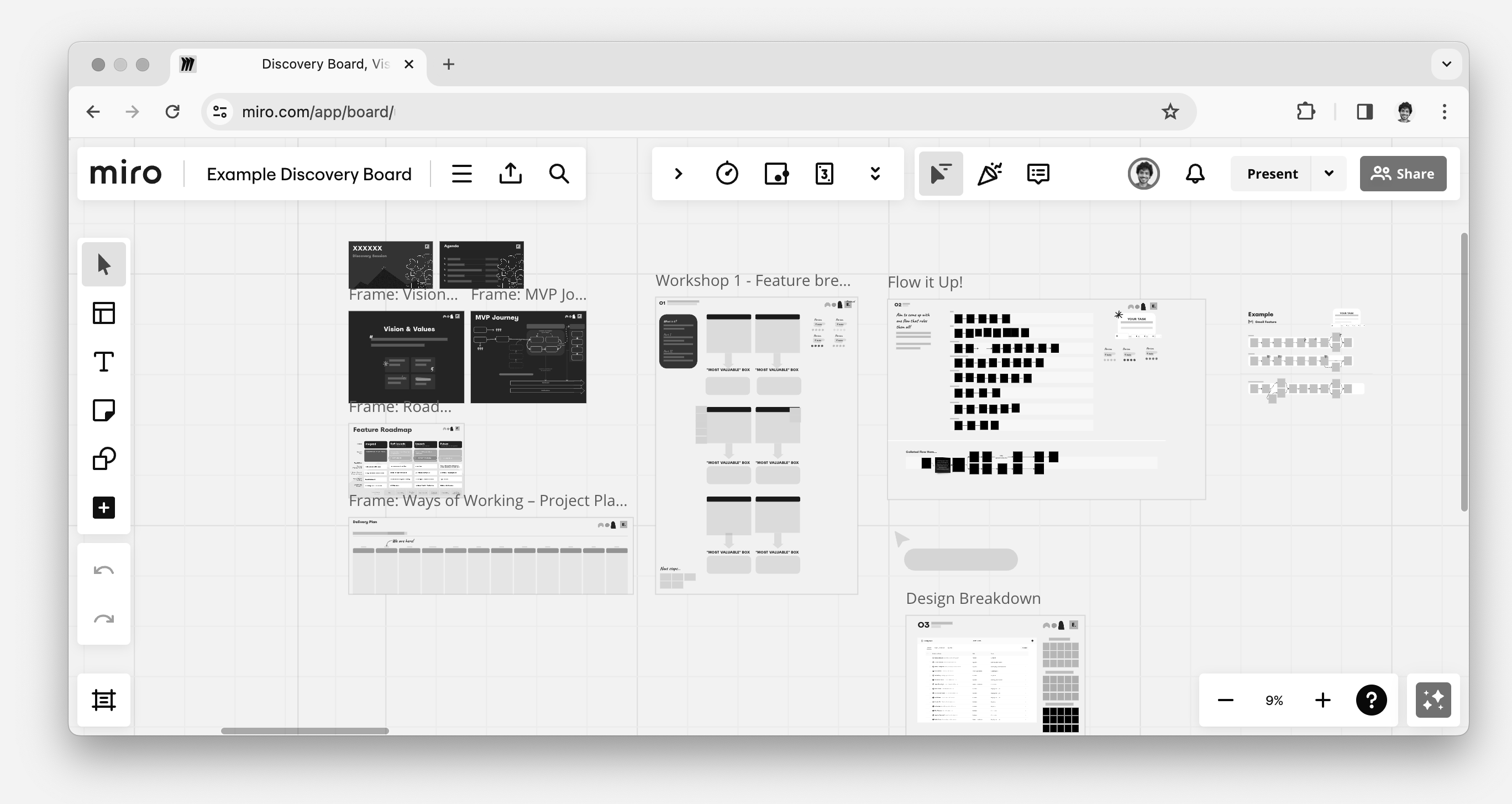
Initial workshops to establish the MVP
Result
Four deliverables:
A unified multi-module knowledge base.
Collecting, maintaining, and reporting happen inside one system, instead of across siloed spreadsheets and handovers.
The Data Blueprint.
Shared UX patterns for filtering, detail, editing, collaboration, and reporting. A new module reuses the system instead of becoming a new app.
Operational accelerators.
Quick Tasks, tagging, field dependencies, notifications, and tiered documentation, for a user base with very mixed expertise.
Records that carry their own provenance.
Every value travels with its owner, its validation state, and its last-updated date. A report can be questioned without being re-gathered.
Same decision, two data paths: siloed spreadsheets versus a centralized knowledge-base.
The system centralised collection, validation, collaboration and reporting. Final judgment stayed with the people accountable for the decision.
Impact
Exact usage and performance figures are confidential; impact below is described qualitatively.
-
Stronger decision confidence.
Management stopped reconciling versions and started reading one current record. Status meetings could focus on decisions, not on whose spreadsheet was right.
-
A lower expertise barrier.
Quick Tasks and tiered documentation let occasional users contribute correctly without learning the whole system first.
-
Data quality as a system property.
Validation, field dependencies, and centralised access control moved data quality out of individual discipline and into the application itself.
-
Consolidation savings.
Reporting stopped being a manual assembly job. A stack of overlapping module tools collapsed into one.
Challenges
-
Reconciling stakeholders without building twelve apps.
Each module owner wanted their own workflow honoured. Shared patterns had to be genuinely useful to all of them. Otherwise the system would have broken apart into the thing it replaced.
-
Moving people off their own spreadsheets.
The old process worked for the person who built it. Migration was a question of habit and ownership more than of features.
-
MVP scope against interconnection.
Modules had to stand alone and connect. Every new connection pushed the MVP later. Every deferred connection made the system feel less like one thing.
-
Designing without seeing production.
Sensitive data meant limited access to the live environment, and limits on what could be discussed. So research leaned on structure and behaviour rather than content.
-
Keeping tags worth having.
Tagging solved retrieval and created maintenance. Someone has to curate a vocabulary, or it turns into a second kind of mess.
One module shipped end to end, against every stakeholder process modelled at once. What each end costs is the third challenge above.
Role
Senior UX Consultant
Owned the unification strategy,
establishing what every module would share and where each was allowed to differ.Ran research per module
with its stakeholders and its future users: user interviews sampled worldwide (a few people per location, with cultural spread across countries and regions), diary studies to understand real workflows, and usability testing when new features shipped. Findings were then reconciled into one set of patterns.Drove the iterative design
from navigation concepts through prototypes to shipped modules.Ran accessibility reviews
on dense tables, forms, and AI answer surfaces so keyboard use, focus order, and screen-reader labels stayed workable as modules grew.Aligned the work with the AWS design system,
and extended it where dense data work outgrew the defaults.
Account Manager
Held the relationship
between AWS and Everest Engineering, including scope, expectations, and account growth.Coordinated delivery
across internal teams and kept communication between the two organisations working.
Team leader
Led the developers and the business analyst,
unblocking, coaching, and translating between stakeholder language and implementation.Brought engineering into design sessions
early enough that MVP cuts were made on evidence, not on deadline.
Learnings
-
Trust must be inspectable.
Ownership, validation state, and a last-updated date do more for confidence in a number than any amount of reassuring copy around it.
-
Working backwards beat trying to solve everything at once.
One coherent module, shipped, produced better decisions than four modelled in parallel and delivered later.
-
A shared pattern language is the product.
The Data Blueprint let a dozen different processes ship as one system. It was also the fastest way to explain that system to anyone.
-
Consulting and team culture decide whether it ships.
A multi-module system fails on relationships and sequencing long before it fails on interface decisions.
Bonus
The Data Blueprint framing proved useful well beyond the screens it was drawn for. It gave stakeholders a shared vocabulary for arguing about their own processes. It also made the boundary between a validated record and an assistant's suggestion easy to explain in one sentence.