Interactive
Elements
Quick click-through a couple of Hitachi Energy Pages
Problem
Web analytics showed a drasticaly high bounce rate for pages that where 2 levels deep or lower in the navigation hierarchy. Pages that where 2 or more levels deep: were accessed only throughs search or links from third parties.

‘Some of the objects in the page are clickable others are not yet they still look similar? ...also even if I manage to indetify a link, I'm not sure where I'll be going next ’
Client
Needs to actively identify link to navigate through content

‘There are more that 15 elements I can use as links. Many times I don't link them anywhere... just use them to make the content "stand out"’
Web Editor
Decides on using linking elements randomly when creating pages
Back To TopProposal & Process
The proposal was to create a unified design for interactive elements and enhance the configuration of existing components to improve the user's foresight of the link created.
It was necessary to go through the following steps:
- Listed all of the existing interactive components
- Provided a visual guide of the configurations available per component
- Visualy displayed their states (initial, hover, active...)
- Analyzed how the components were being used (E.g. pointing to video, linking to internal pages, linking to documents, etc.)
- Created a new style for existing components: started with a concept of the basic button and grew from there
- Tested prototypes of new designs collaborated with branding on new designs
- Mapped all existing configurations to new designs and established new configurations that could improve the user experience
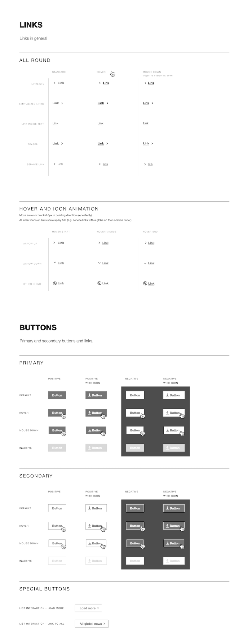
Design Specs for buttons and links
Result
Perceptible affordance, information on link's target, and a consistent design across interactive omponents made it easier for users to diferenciate between: a teaser component and an image, a link and highlighted text, a link to a video or a link to a document, and so on.
Several months after the redesign of the interactive components, we compared the 'bounce rate' from high level pages and got to see a drop in the amount of users that left the website on that level.
There was a drastic increase in access of pages on a 3rd or lower level (in many cases a 40+% increase)
Additionaly, editors working on the website and colleagues from the company were happy to provide positive comments regarding how easier it had gotten to navigate through pages.
Documentation of the Teaser component: content editors favorite component to link pages due to its visual appeal
Impact
Better reach of low level pages meant an increase in the number of viewers of these pages on the external website.
There was a decrease in the number of ticket requests to the IT and HR departments. Before the redesign, a large inflow of tickets were related to documents publicly available in the intranet.

Design Specs for Anchor components: used for in-page navigation.
Challenges
This initiative faced many difficulties, among them:
- To ensure a smooth transition without requiring manual changes in almost every page of the website and intranet: he structure of existing component could not be broken. This meant only changes in appearance could be possible or adding configurations with a 'smart default' associated to the components pre-existing configurations
- Deprecating an existing component requires long-term planning, teaching editors, and clear communication on the component's deprecation. Additionaly, a solution should be implemented in the most automated way possible.
- Long story short: we had to deprecate a component and later renable it. ):
Role
This initiative required me to wear two hats:
User Experience Researcher
- Created a listed all of the existing interactive components with a visual guide of the configurations available per component
- Went through 100+ main pages and analyzed how the components were being used
- Created a prototype to test the new components: this was not used due to lack of time
- Helped established new configurations that could improve the user experience of the teaser component
Project Manager
- Coordinated with the design team the handover of analysis
- Supported the critique of the first design iterations
- Coordinated collaboration with branding team and design team
- QA, technical testing and release documentation of the components
- Presented the new designs to the communications' departments

Breadcumbs became a standard in all templates for an easier navigation.
Learnings
From this project I got three main takeaways:
- Visual changes can be a 'hard sell' since the results take time to be considered quantifiable. If you are lucky, users will notice them as a good change and be vocal about them
- Put the cards on the table: make sure that stakeholders understand problems by possibly showing the whole picture first and then focuse on details when neccesary
- Component deprecation is a very delicate subject: timely communication and an alternate solution that works automatically are vital for a frictionless transition